Tablefair
Tablefair is a pantry brand I designed to elevate everyday basics—salt, pepper, and olive oil—through clean design, high-quality materials, and strong shelf presence. The goal was to create something that feels refined and essential at the same time. Quietly premium. Nothing unnecessary.
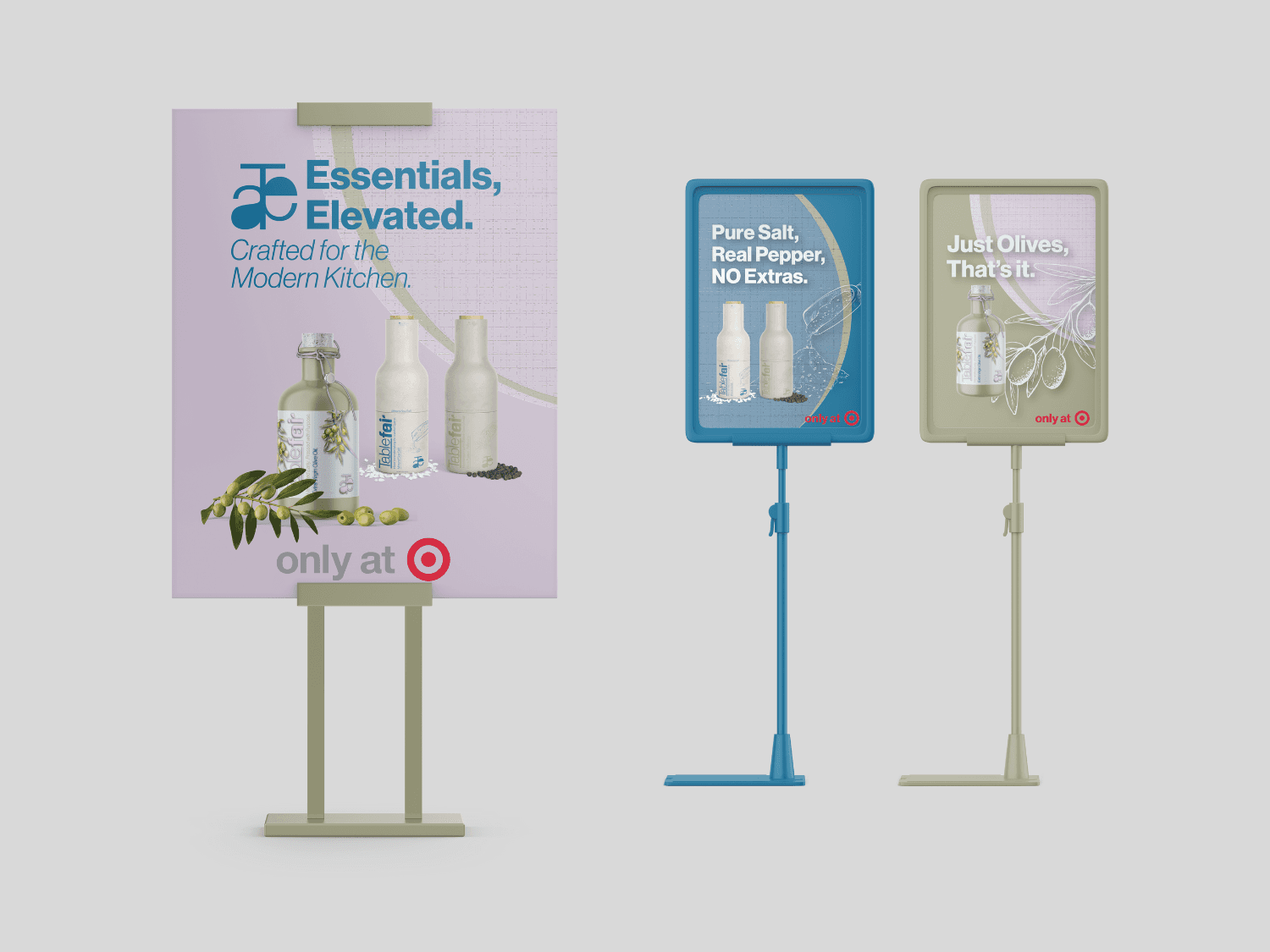
The brand identity blends modern structure with a soft, earthy edge. The logotype is bold but approachable, with a custom ligature that gives the wordmark movement and personality. I developed a color system that aligns with the product types but still feels cohesive as a brand family—muted green for olive oil, soft stone for salt, and warm gray for pepper. These tones are carried across both packaging and point-of-sale signage to keep everything consistent.
The packaging was designed to feel tactile and durable:
Olive oil is housed in a matte ceramic-style bottle with a swing-top closure for a heritage-meets-modern look.
Salt and pepper grinders are made from ceramic in colors like Chalk Sand and Ash Dune, chosen to match the oil bottle while adding warmth and texture to the countertop.
Labels were kept minimal and clean, with illustrations and product cues woven in just enough to educate without clutter.
The layout of each SKU was designed specifically for on-shelf appeal—when lined up, the labels and brand marks create a unified system that grabs attention while staying visually balanced.
Tablefair is made for:
Home cooks and design lovers who want pantry staples that feel considered
Customers in their 30s–50s who care about what they bring into their homes—from ingredients to aesthetics
People who value function but aren’t willing to compromise on form
Shoppers who look for minimal packaging, clean labels, and a modern tone
At its core, Tablefair is about elevating the everyday. I built the brand to feel clean, timeless, and quietly confident—just like the kitchen it belongs in.
Service Provided
Brand Design / Package Design / In-store Signage




Recent Designs